

Transparent and blurred-out backgrounds. Eye-catching and colorful images. Multi-layered technique.
You’ve seen them on both Apple and Microsoft devices. You love the UI architecture. You wonder what that is. Let us answer the question.
The feature — which is gaining popularity each day since the end of 2020 — is called Glassmorphism.
We know what you’re thinking, “Let’s hire UI developers to add Glassmorphism to our website.”
However, you must know what the feature offers and how it works before you hire a UI developer. The knowledge will help you in gauging if the UI developers are doing their job well. Furthermore, if you’re a UI developer, the information will tell you what to do to make the most out of the feature.
We’re here to help you with that. In the next five minutes, we’ll tell you why should UI developers care about Glassmoprhism. The article will discuss:
- The definition of Glassmorphism
- Glassmorphism style elements
- How can you include the Glassmorphism style in your website
- What are the benefits of the Glassmorphism
- What things you shouldn’t do when using the Glassmorphism style
- Which popular companies use the Glassmorphism style
Without further ado, let’s begin.
Note: the information is true at the time of writing. That’s September 2022.
Why should UI developers care about Glassmorphism — a comprehensive guide
What is Glassmorphism?
Glassmorphism stands for the UI architecture that focuses on light or dark objects over colorful backgrounds. The feature creates a ‘through the glass’ look and feel on the user interface elements.
The key characteristics of Glassmorphism are:
- Transparency and frosted glass effect. The feature offers the objects a background blur as well. The process allows the background to show through; thereby creating the look of frosted glass.
- Bright and eye-catching colors to make the blurred transparency more prominent.
- Multi-layered approach with floating objects in space.
- A subtle border on the edges of the translucent objects. The borders help the objects to stand out from the background.
The verticality and the ability to see through it result in users establishing the depth and hierarchy of the Glassmorphism UI interface.
UI developers use the card-based interface to design the user interfaces of websites, web apps, smartphones, and mobile apps.
Elements of Glassmorphism
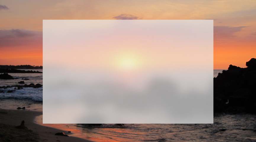
- Transparency and frosted glass effect through background blur
Transparency and background blurs are the most essential Glassmorphism elements that create the glassy effect. The glassy effect, in turn, establishes verticality and offers more dimensions to the style.
The result? A sense of perspective on the layout that makes the UI feel like the elements are floating in 3D space.
Furthermore, Glassmorphism is a card-based interface. Thus, each card or layer on top attracts more light. The process increases the highest transparency of the topmost layer while deeper layers receive lesser transparency; thereby enhancing the background blurring effect.
Furthermore, UI developers add a subtle shadow around the card contours to create the impression of extra depth in the UI elements.
- Multi-layered approach
Glassmorphism offers a multi-layered style where colorful and transparent layers are placed on a blurred background. Thus, the multi-layered style offers a smooth interface that is clean and soothing to the eyes.
The look goes well with one or multiple translucent layers on a bright and colorful backdrop.
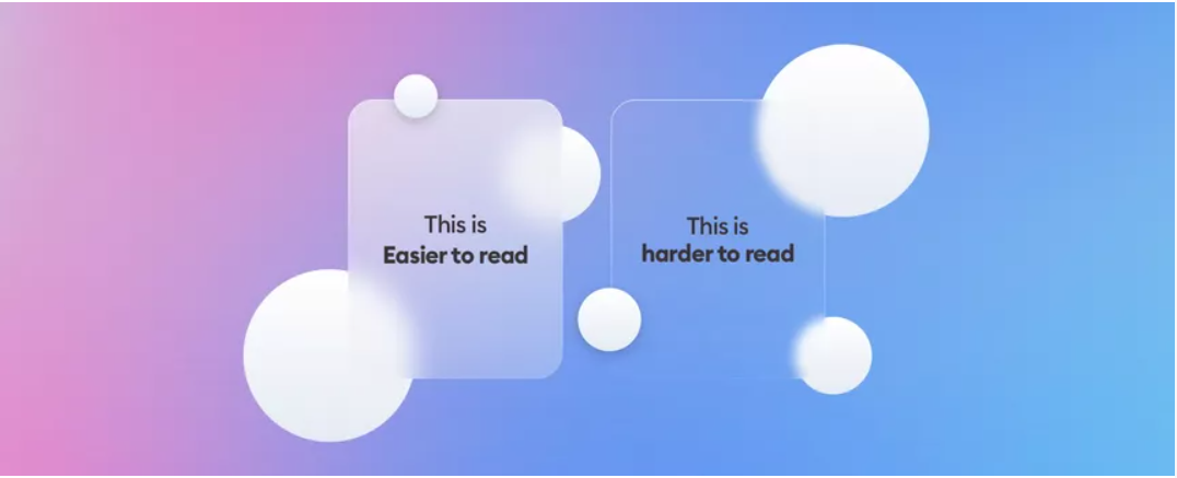
- Vivid color combinations and translucent objects with subtle borders
Glassmorphism demands using bright yet subtle colors. Why? The combination emphasizes the blurred transparency.
The feature is essential for users to notice the impact. If the backgrounds were low-contrast and dull, the background would have faded away beneath the surface. Thus, the Glassmorphism effect would’ve been lost.
Furthermore, Glassmorphism comes with semi-transparent white borders. The feature simulates the glass edges. The process allows the elements to stand out from the background.
How to make the most out of Glassmorphism
- Opt for the appropriate layers
Go for one or two elements at a time. Choosing such a number of elements offers the best background blur effect. Furthermore, choose a colorful and light background for the best results as well.
Note that icons built in Glassmorphism appear divisive, especially when it comes to accessibility. Thus, you should use the icons sparingly.
A general rule of thumb to remember is that the Glassmorphism design looks best with simple effects floating on blurred backgrounds with contrasting colors.
- Offer the UI a frosted glass feel
The most essential step is to choose the correct transparency level. You should opt for making only the fill of the element transparent, not the entire shape. The process helps you to achieve the frosted glass feel.
However, do the opposite and you won’t receive the desired results.
Furthermore, you can include a 1p semi-transparent inner border to elevate the design as well. The method enhances the frosted glass effect and the elements stand out from the background; giving the users a pleasant user experience.
You can use tools such as Figma to achieve the frosted glass feel.
- Include gradients
Go for gradients with a similar color scheme to the background of the Glassmorphism style. The process creates harmony between all the elements that are present in the look of the user interface.
- Opt for geometric elements and 3D designs
Choose simple shades and edit the border radius when you use geometric elements. Furthermore, use a Glassmorphism overlay to make the 3D element stand out as well.
Benefits of Glassmorphism
- Engages the user and offers a smooth user experience
- Offers a clean and minimalistic look
- Offers a dynamic design language
Things to steer clear of in Glassmorphism
- Never use Glassmorphism in too many parts of your UI. Limit the feature to up to 3 glass elements. Overdo it and the UI will have accessibility issues; thanks to the blur and transparency feature of Glassmorphism.
- Never opt for a clear and monochrome background. Instead, go for multiple colors, gradients, and elements.
- Never saturate the shadows too much and never opt for black. Use light background colors and include a shadow a few notches darker. Furthermore, set the blending mode to ‘multiply’ as well. However, if the background colors are darker and come with dark gradient elements, go for a lighter shadow for achieving the glow effect.
- Never apply transparent and blurring effects together in areas that need active interaction.
- Never use the design aesthetics on the navigation menu, buttons, and toggles.
Mainstream use of Glassmorphism
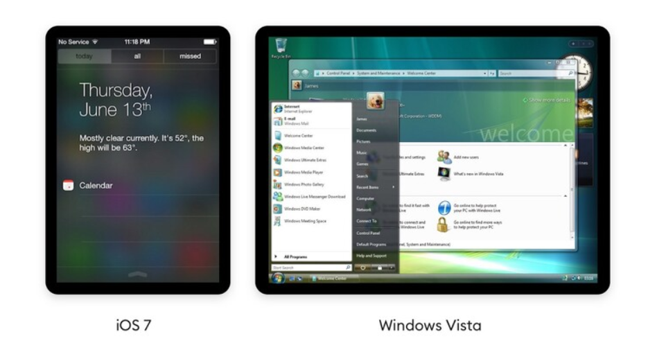
- Apple’s iOS 7
- The Mac OS Big Sur
- Fluent Design System by Microsoft (Microsoft calls the design system ‘The Acrylic’)
Why should UI developers care about Glassmorphism — the trend is here to stay
Apple. Microsoft. Dribbble.
These are some of the giants that use Glassmorphism. If these leading companies are using the style, you can be sure the trend is here to stay. Thus, the only sensible thing to do would be to hop on the trend.
Furthermore, the Glassmorphism style hooks the user’s attention and inspires them to engage with the website content as well.
Now that you know why should UI developers care about Glassmorphism, the information will help you make the most out of the feature.